1. Branding Theme: “Strategy Studio” / “Domus Strategia” (Architecture)
1.1 Name Ideas
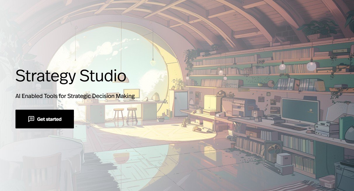
Strategy Studio
Domus Strategia (“Strategy House,” Latin variant)
Emphasis: an architectural/design motif—like a creative studio where strategy is “crafted.”
1.2 Visual Elements
Logo Mockups:
Classical architectural imagery (e.g., columns, drafting tools, blueprint grids).
Clean, geometric layouts – think of a stylized studio space or blueprint overlay.
Bullet/Emoji-Sized Icon:
A simplified architectural blueprint or a stylized drafting compass.
Minimal detail, so it remains legible at ~128×128 px.
Finer Details:
Neutral tones (e.g., slate grays, off-whites) and clean lines—conveys “craftsmanship” and intellectual rigor without feeling dusty or overly academic.
1.3 Tagline Suggestions
“Knowledge & Tools for Competitive Advantage”
“Where Strategic Thinking Takes Shape”
(implying a “studio” where ideas are built)
1.4 Three Font Suggestions
1.4 Three Font Suggestions (Microsoft Word–Available)
Garamond (serif)
Why: Its elegant, old‐style serif strokes evoke classical craftsmanship—perfect for an architectural “studio” motif. Garamond feels scholarly yet creative, much like a design atelier.
Cambria (serif)
Why: Built for on‐screen readability, Cambria offers moderate contrast and clean lines. It strikes a balance between classic and modern, aligning with the “studio meets strategy” vibe.
Times New Roman (serif)
Why: Timeless and highly legible, Times New Roman conveys reliability and tradition—useful for body copy or captions that need to feel grounded.
1.5 Webpage Layout Concept
Hero Section (Fold 1):
Full-width photograph or stylized illustration of an airy “studio” (drafting tables, whiteboards, architectural plans).
Overlay: Logo (e.g., a simplified “Domus” roof-line or blueprint icon) + one of the taglines.
Primary Call-to-Action (CTA) button: “Explore Our Frameworks.”
Below the Fold (Three-Column Grid):
“Our Philosophy” – short blurb with a blueprint-style icon.
“How It Works” – a three-step carousel, each accompanied by an architectural detail (compass, plan, build).
“Client Examples” – rotating case-study thumbnails framed as mini-floorplans (hover reveals title/text).
Mid-Page (Full-Width Band):
A minimalist “blueprint” graphic showing a high-level flow: Phase 0 → Phase 1 → Phase 2 → Phase 3.
Each phase box is clickable, revealing a brief “Studio Session” video snippet overlay.
Lower Section (Testimonials + Partner Logos):
White callout boxes styled like blueprint notes, featuring 2–3 client quotes.
Grayscale partner logos beneath—kept neutral to maintain the “studio” aesthetic.
Footer:
Dark charcoal background (#2F3E46) with light gray text (#F8F4E3).
Horizontal lists: Resources | About | Contact—styled like “blueprint notes” (light blueprint grid behind text).
Tiny “studio floorplan” icon linking to “Sign Up.”
1.6 Advertising & Marketing Program
“Studio Sessions” Webinars (LinkedIn-Sponsored):
Monthly webinars titled like “Blueprinting Competitive Advantage,” “Framework Foundations.”
Use carousel ads on LinkedIn that mimic drafting plans being unrolled, targeting strategy-role titles.
Collaborative “Strategy House” Whitepaper (Programmatic Display Ads):
Quarterly e-book designed to look like a bound architectural portfolio.
Gate behind a “Download the Blueprint” form; promote on HBR.org and Forbes via display banners featuring blueprint imagery.
“Strategy Co-Lab” Pop-Up Events:
Half-day in-person “co-lab” sessions in major cities (NYC, London, Singapore).
Room styled like an actual design studio (drafting tables, blueprint walls).
Invite via direct mail postcards stamped with a “floorplan” seal.
Collect attendee emails for a drip email series called “Construct Your Plan.”
1.7 Three Market Segments
Leadership Teams at Mid-Sized Professional Services Firms (50–200 employees)
Value structured, repeatable “studio” workflows to align partners. Architectural metaphor suggests rigor.
“DIY” Management Consultants / Independent Strategy Advisors
Crave a toolkit they can customize—like drafting their own “plans”—but under a polished, professional veneer.
In-House Corporate Strategy Units at Tech Scale-Ups
Tech founders often have “designer” sensibilities and appreciate modern-classical interplay. A “Strategy Studio” aligns with an internal “innovation lab” mindset.
1.8 Color Scheme Recommendations
Primary Colors:
Slate Gray (#2F3E46) – evokes blueprint or charcoal strokes on white.
Ivory White (#F8F4E3) – for backgrounds, reminiscent of architect’s drafting paper.
Accent Colors:
Blueprint Teal (#3A8EA5) – highlights buttons, links, or “phase” indicators.
Burnt Sienna (#D95D39) – sparing use for callouts, mimicking red-ink annotations on sketches.
Why: Slate Gray + Ivory White keep the palette neutral (studio feel). Teal nods to blueprint lines; Burnt Sienna mimics revision marks—overall, a “professional atelier” vibe.
1.9 Social Media Platform Fits
LinkedIn
Host “Studio Session” clips and slide-share presentations. Ideal for targeting business-focused webinar attendees.
X (formerly Twitter)
Share “micro-blueprint” insights: one-line “architectural approach to strategy,” linking to short blog posts or design-style tips.
YouTube / Vimeo
Host “Strategy Studio Masterclass” videos—animated walkthroughs of the “virtual studio floorplan.”
Emoji Options:

Emoji

Bullet

Emoji