Bullet
3. Branding Theme: Ship (“Endeavor” / “Enterprise”)
3.1 Name Ideas
Endeavor (captures the sense of embarking on a strategic journey)
Enterprise (implies scale, ambition, exploration—“sailing toward new markets”)
3.2 Visual Elements
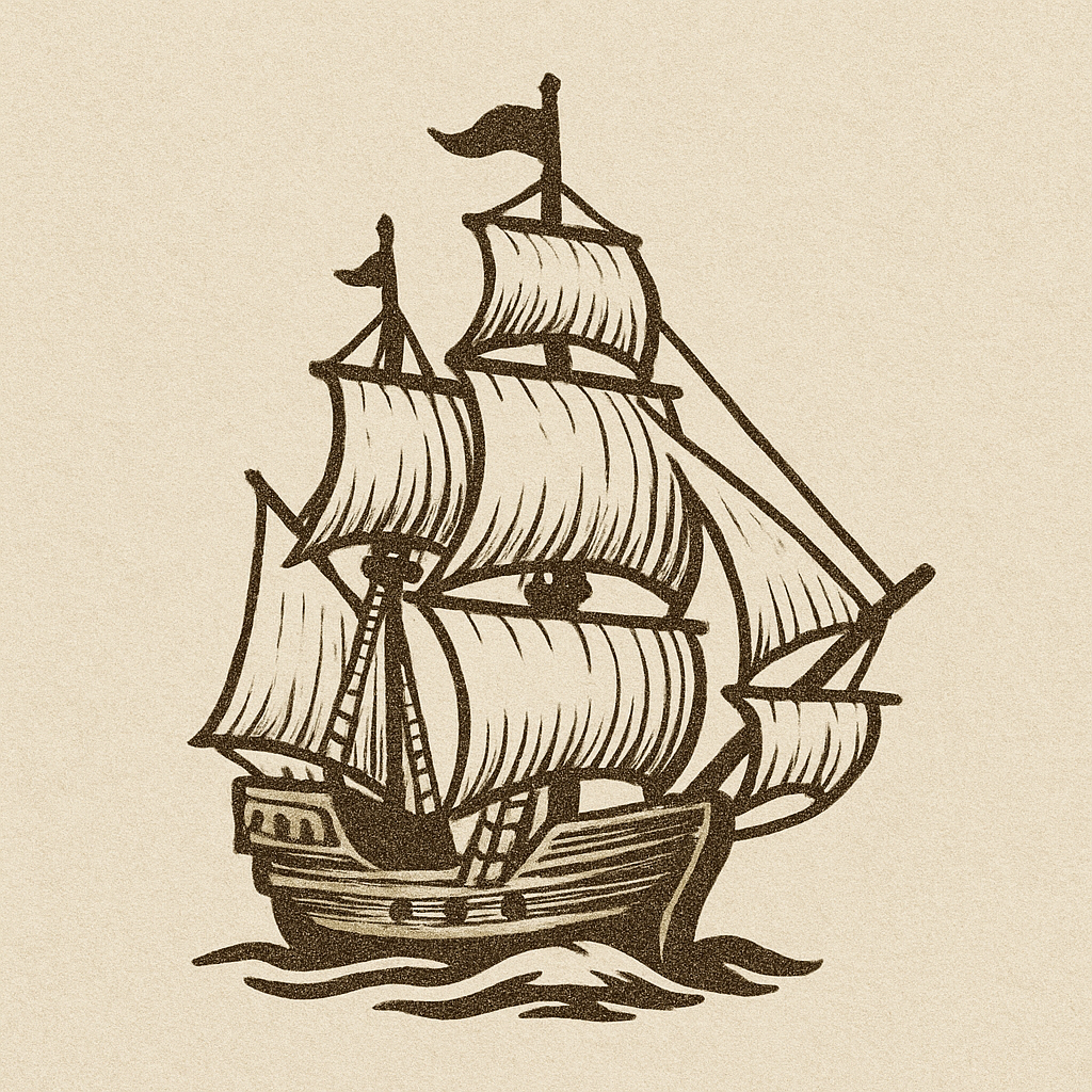
Hero Image:
Stylized ship sailing into the horizon (abstract, minimal detail).
Crisp lines, simplified waves—evoke forward momentum.
Logo Lockups:
“Enterprise: Tools for Strategy”
“Endeavor: Tools for Strategic Thinking”
Bullet/Emoji-Sized Icon:
Simplified ship silhouette (single sail or hull outline) at ~128×128 px for bullet lists or favicon.
3.3 Tagline Suggestions
“Chart Your Course to Competitive Advantage”
“Sailing Toward Strategic Clarity”
3.4 Three Font Suggestions
Cinzel (serif)
Why: Inspired by engraved capitals, feels classical and maritime—recalling carved figureheads or ship crests.
Lora (serif)
Why: Calligraphic details and balanced serifs evoke nautical logbooks and old maps; highly readable.
Poppins (sans-serif)
Why: Rounded, geometric shapes recall portholes and waves—energizes headings or buttons.
3.5 Webpage Layout Concept
Hero Section (Fold 1):
Full-bleed illustration of an abstract ship hull slicing through water toward a distant horizon; waves simplified.
Overlay: Logo (minimalist ship icon) + one of the taglines.
CTA: “Set Sail Today” (ocean teal button).
Below the Fold (Split Hero + “Captain’s Log” Sidebar):
Left (Main Panel): “Voyages”—scrollable timeline of client journeys (e.g., “2024 – Merged $50 MM portfolio”). Each entry plotted on a simplified map with a small ship icon.
Right (Sticky Sidebar): “Captain’s Log” feed—short strategic tips (“Wind & Current Analysis = Market Trends”) styled like a parchment textbox.
Mid-Page (Full-Width “Open Seas” Services Grid):
Four square cards:
“Competitive Navigation” (icon: sextant)
“Risk Reconnaissance” (icon: spyglass)
“Route Planning” (icon: compass rose)
“Cargo Optimization” (icon: crate)
Hover: card border glows ocean teal; icon lifts as if “waving.”
Lower Section (Client “Ports of Call”):
Stylized world map with pins for major clients/launch sites; click a pin to reveal a short case study (“How Acme Corp Sailed into EMEA”).
Footer:
Dark navy background (#0B1F3D) with white text.
Small “rudder” icon next to social links (Facebook, LinkedIn, Instagram).
3.6 Advertising & Marketing Program
“Voyage Reports” Newsletter (LinkedIn InMail):
Quarterly PDF styled like vintage naval charts—“Q2 2025: Heading Toward Asia-Pac Expansion.”
Tease with a downloadable map snippet; capture emails via LinkedIn outreach to senior execs.
Virtual “Captain’s Table” Roundtables (LinkedIn Events):
Invite C-suite to half-day sessions titled “Plotting the Next Leg” (“Navigating Regulatory Headwinds”).
Promote on LinkedIn; follow up with “Captain’s Log” recap email series.
Interactive “Ship Simulator” Microsite (Facebook & Instagram Ads):
Mini-game: “Plot a trade route across shifting market conditions.”
Ads: 15-sec video of the simulator in action with “Ready to Chart Your Course?”
3.7 Three Market Segments
CEOs & Executive Teams of Mid-Market Manufacturers
They “ship” physical goods and relate to maritime metaphors of route planning and cargo optimization.
Logistics & Supply Chain Directors
Live in “shipping lanes” of market fluctuations; “navigation” metaphor is directly relevant.
Growth-Stage SaaS Founders Expanding Internationally
Think in terms of “charted waters” for new markets; “voyage” imagery matches expansion narratives.
3.8 Color Scheme Recommendations
Primary Colors:
Deep Navy (#0B1F3D) – “midnight ocean” feel; anchors brand in authority.
Seafoam Teal (#1CA7AC) – bright enough for CTAs, evoking movement like waves.
Accent Colors:
Sail White (#F5F5F5) – backgrounds or large containers, reminiscent of sails.
Burnished Gold (#D4AF37) – sparing use for “stars on the mast” (awards, badges), hinting at prestige.
Why: Dark navy is authoritative; seafoam teal suggests forward motion; sail white is clean; gold hints at timeless craftsmanship and success.
3.9 Social Media Platform Fits
LinkedIn
Share “Voyage Reports” as PDFs, publish client success stories (“Port of Call: How X Corp Sailed into Europe”).
Instagram
Reels: stock clips of ships at sea morphing into strategy icons (sextant, compass).
“Captain’s Log” Stories: quick strategic tips (“Avoid the Iceberg: 3 Steps for Risk Mitigation”).
YouTube
Host a “Captain’s Corner” video series—2–3 min explainers (“Why Your Competitive Landscape Is Like a Shipping Lane”).